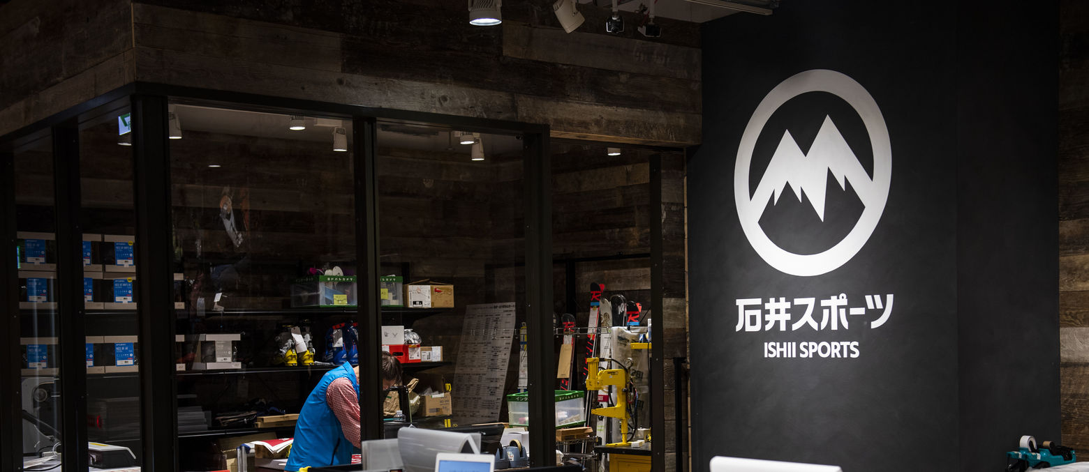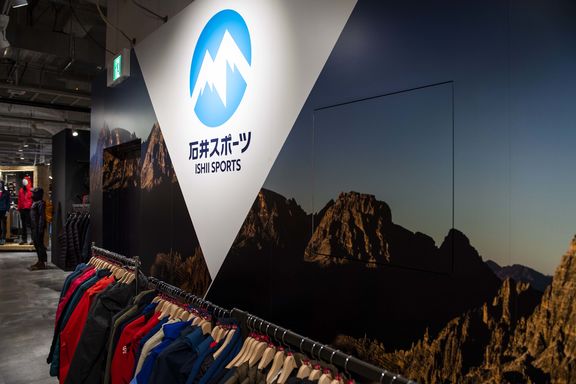
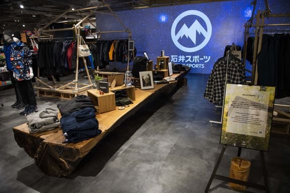
New store. Newer logo.
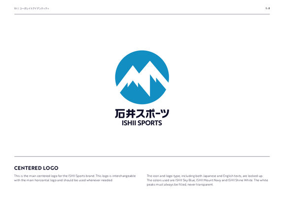
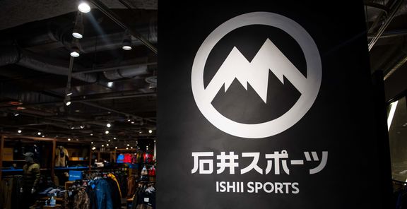
Recently, they opened a brand new store and decided to use the opportunity to open the doors with a refreshed brand look and feel. For the redesign of ISHII Sports it was important to keep the most recognizable asset of the icon, the twin peaks, but give it a clean and international-friendly update.
Whilst still visually close to the previous version, the new logo enhances the twin peaks - with a simple and strong font in both English and Japanese for the brand name. It looks even more impressive when it’s projected on giant screens all around the store, inspiring mountain adventurers and skiers to go out and enjoy the earth.