- Project360°
- Clientwoom
- Web woom.com
woom
From first steps to fearless rides
When woom approached us, they were already a beloved kid’s bike brand among families. Their bikes, built specifically for children from 9 months to 14 years, stand out through intelligent design, lightweight frames, and a deep understanding of what kids really need.
Our task wasn’t to reinvent woom, it was to sharpen what was already there: to make the brand clearer, more distinctive and more emotionally relevant.
In just four months, we sharpened woom’s brand strategy, rolled out a global brand campaign and design system that translates product excellence into a coherent story of growing up with woom.
The Campaign: Telling the Whole Story
A global brand campaign
Before creating a campaign, we built the foundation. Together with woom, we defined and shaped the brand equity. At the heart of the strategy lies a clear brand vision: inspire kids to fall in love with cycling.
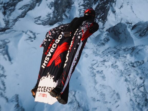
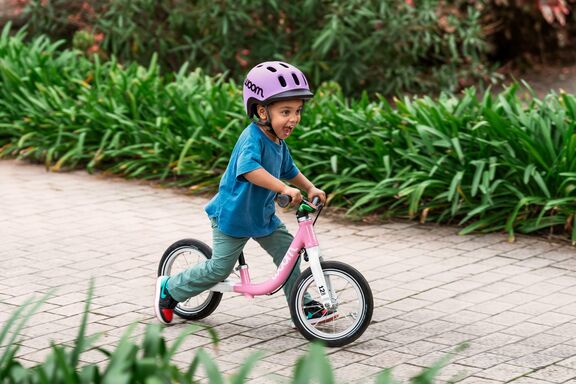
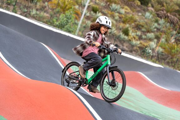
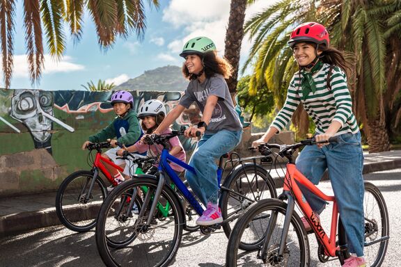
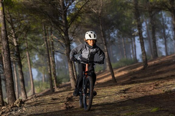
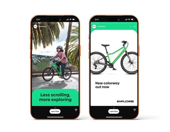
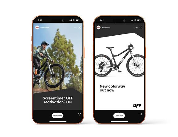
We took the tagline “Enjoy the Ride” and turned it into a journey through childhood. The result is an emotional, cinematic campaign that follows every stage of riding, from wobbles to wheelies, from first steps to bold jumps. Powered by the complete woom lineup: woom WOW, GO, EXPLORE and OFF.
The campaign centres around a 60-second hero film designed as the starting point for the entire digital rollout.
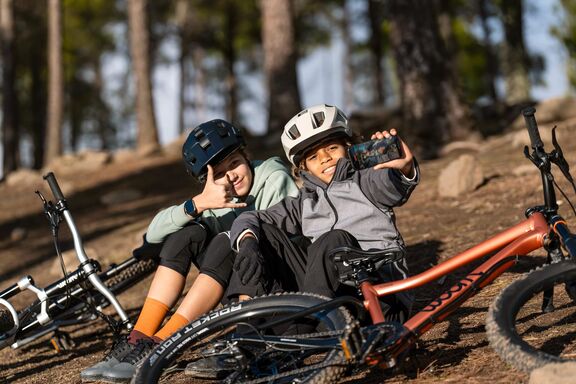
Shot by Kids. Told by Life.
How do you build emotional connection with a new generation of customers? You don’t just tell their story, you let them tell it themselves. Instead of just pointing the camera at the kids, we handed it over. Equipped with Smartphones, GoPros and Insta360s, they filmed their own rides and perspectives. Why it works? Because it puts the audience at the center, not just as viewers, but as creators. It reminds us that the most powerful campaigns don’t just show the product, they show what it means.
Content that moves - and converts
From the hero film, we developed a set of paid media assets. We produced dedicated sales videos for each bike category, combining emotional scenes from the brand film with clear consumer benefits — giving every model a distinct message and a strong reason to buy.
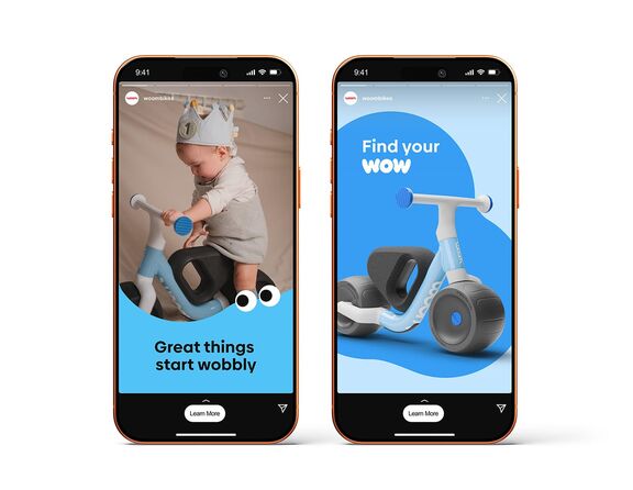
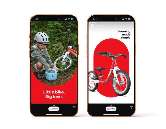
To support the rollout across all touchpoints, we also delivered a comprehensive set of stills to ensure visual consistency and campaign reach across every format and market.


CI Refresh: A Visual System That Grows Up
While the campaign concept was taking shape, we refreshed woom’s corporate identity across all brand levels.
At the core, we strengthened the umbrella brand, giving it more distinction and flexibility, including the introduction of a bold teal alongside the iconic woom red and the development of distinctive graphic elements inspired by the woom logo shape.
At the same time, each sub-brand received its own distinct expression. From soft, round shapes that speak to protected first rides, to sharp, dynamic elements that visualise independence and adrenaline on the trail. A design system that grows up with the rider.
We further refined the brand’s voice, signature look, music identity, fashion style and woom’s social presence. A complete brand system, ready to roll globally.
LIKE WHAT YOU SEE?
LET'S GET TOGETHER
We’re full of ideas and ready for any challenge; no matter how big or small. Jump onboard and together we’ll make great things happen.
You in?